What if I use color to represent a gentle strength?
Today I was thinking about something both gentle and strong too, like a whisper in your ear or a cool breeze on the back of your neck. Or like the strength we all have inside when we are brave enough to look for it.
I did not have an image in mind when I started, only some colors. I wanted to use purples, because to me purple conveys power and strength in a gentle way. It is the color of shadows, something that shows us the strength of the light.
At first, I was thinking of only purples in varying shades. I wanted something to transition from lightest to darkest shades from top to bottom, showing we are strongest when we have two feet on the ground and our head in the clouds. I started making gentle sweeps of pastels from one side of the paper to the other, not wanting to make anything bold, keeping it all gentle and flowing and softening edges with my fingers.
Here is the first piece I created with this mindset.
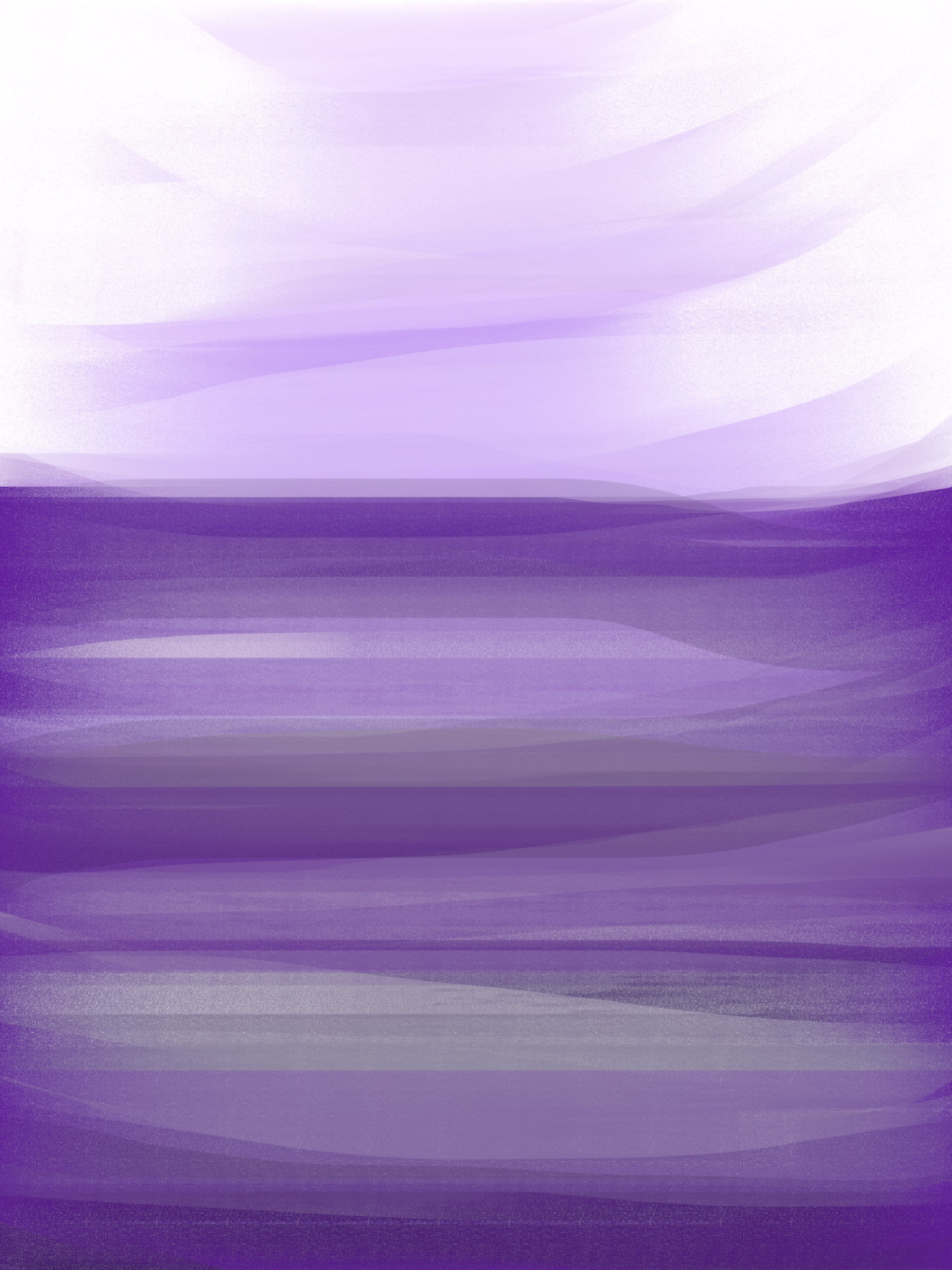
(c) 2014 Amanda Balough
I liked this one, but it seemed more quiet than strong, like it had the gentle part, but not the strength.
So I started thinking strength needs more of a color palette than purples alone if I’m not using imagery. I added some blues and magentas, purple’s close friends and family, and then some yellow highlights, purple’s nemesis. We are strongest when in harmony with our environment, but the strength can’t be seen until we have something opposing us. So this purple needed a yellow adversary. Even more than that, I wanted to show how the opposites actually strengthen each other.

(c) 2014 Amanda Balough
I switched to acrylic paint, the pastels didn’t feel right any more, too soft. I used the same sweeping motion, big strokes across the entire scene to blend it all together.
This one ended up appearing like an abstract horizon – this was not intentional and surprised me. I was so focused on getting the colors to play along that I did not notice at first.
I wanted the darker colors of purple to be at the bottom to show the strength, like standing on solid ground. Then I wanted a playful and much lighter top portion, to show that the strong are lighthearted and always looking up. And then I wanted strong blasts of bright color in the center, to show the joy and boldness we have at our cores.
Also notice there is no true white or black in this piece. Strength is not all or nothing, not black or white, but a blending and culmination of all that we are and can be at once.

It turned out beautiful. I love the colors.
Thank you!